The Pantone Color of the Year for 2022
At Bretz Interiors serving the greater Denver area, many of our customers frequently ask us about color and what it can or should do for their homes. We know that even though color can be daunting for some people, especially if they’re not designers, they still want their homes to look good, feel inviting, and be up to date. That’s why we keep on top of color trends—to help our customers understand what’s out there and stylish, so they can decide if the styles suit them or not. One of the biggest indicators of style is the Pantone Color of the Year, released every December to predict the trend for the upcoming year. And this year’s color sure is an interesting one! Read on to learn more about Pantone’s selection for 2022.
Why Is Color Important?
Color enhances our mood, and even more, it often also reflects it. The professionals at the Pantone Color Institute know color inside and out and understand its impacts on culture and cultural climate. “The Pantone Color of the Year reflects what is taking place in our global culture, expressing what people are looking for that color can hope to answer,” said Laurie Pressman, vice president of the Pantone Color Institute. Color is not a designer’s whim. Color trends come from where we are, where we want to go, and how people are feeling or not feeling. “The Pantone Color of the Year has come to mean so much more than ‘what’s trending’ in the world of design; it’s truly a reflection of what’s needed in our world today,” Pressman also noted.
How the Color of the Year Is Chosen
“Color is an equalizing lens through which we experience our natural and digital realities,” said Leatrice Eiseman, executive director of the Pantone Color Institute. Color inspires numerous industries, including home furnishings, window coverings, industrial design, fashion, and more. Through things like trend forecasts and color psychology, the Pantone Color Institute helps global brands design products that call on the power and emotion of color by analyzing trends and understanding the zeitgeist of the times.
This Year’s Color
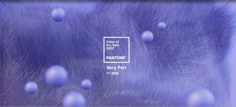
This year, Pantone has designed a new color, PANTONE 17-3938 Very Peri, which is a red violet-infused blue hue. Sprightly, joyous, and dynamic, the Pantone Color Institute describes Very Peri as “a new Pantone color whose courageous presence encourages personal inventiveness and creativity.” They also say that it “brings a novel perspective and vision of the trusted and beloved blue color family” and that it “places the future ahead in a new light.”
How to Bring Very Peri Home
Before you know it, you’ll find this shade everywhere, in anything from décor to kitchenware to clothing. If this color speaks to you, you can add it in bold ways through wall paint, in accessories, or even in your window fashions. Hunter Douglas offers a variety of items that will complement or even carry the color, especially in the Design Studio™, where you can find a multitude of fabrics, from standard designs to unique, exclusive textiles from world-renowned designers. If you want help making a selection, be sure to speak with one of our representatives today.
2022 Color of the Year in Lakewood
Bretz Interiors is a family-owned business located in Lakewood and serving the greater Denver area. In operation since 1959, we focus on delivering high quality products and exceptional service to every client. Our showroom has a wide variety of displays and our sales team is happy to assist you with any questions you may have!

