Trending Color for 2019
Color can set a tone, enhance mood, and make a house a home. And each year, the Pantone Color Institute names a Color of the Year that will be on trend in the months to come. The color they predict draws on influences such as the entertainment industry and areas of design. Whether you like the color or not, you’ll start to see it in numerous products all around. For ideas on ways to add this year’s color to your home, speak with a trained specialist at Bretz Interiors serving the greater Denver area. We’ll be happy to help you make a color change.
About the 2019 PANTONE Color of the Year
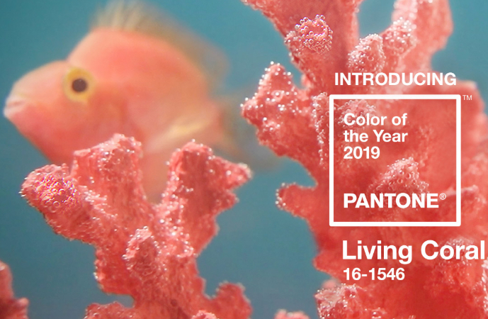
For the past 20 years, the Pantone Color of the Year has inspired manufacturers in industries such as home furnishings, window coverings, industrial design, fashion, and more. Through things like trend forecasts and color psychology, the Pantone Color Institute helps global brands design products that call on the power and emotion of color. Last year’s Color of the Year was bold Ultra Violet. For 2019, it is PANTONE Living Coral, which has a golden undertone that energizes and enlivens with a softer edge.
PANTONE 16-1546 Living Coral
Effervescent, yet mellow, Living Coral grips us with warmth and peacefulness to provide relief in a continually shifting environment. This soothing color encourages lighthearted activity, our need for optimism, and our desire for playful expression. As Pantone notes, Living Coral “is evocative of how coral reefs provide shelter to a diverse kaleidoscope of color.”
Using the Depths of the Sea in Home Décor
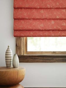
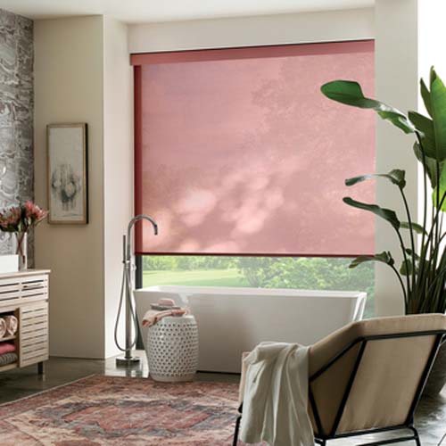
In your home, consider using Living Coral on your walls, window coverings, custom bedding, accent pieces, or even kitchen gadgets and appliances to create a tranquil retreat and more. Consider complementary colors to offset the specific coral hue and to create a complete ambiance. For example, you could get decorative throw pillows in aqua and throws in seafoam. Or add artwork, vases, or table lamps in one of the colors to bring out a pop. For other ideas on complementary colors, check out Pantone’s suggested palettes on their site—click here. Just remember to be open—the possibilities are endless.
The Color of the Year Requires Thoughtful Consideration and Trend Analysis
To arrive at the selection each year, Pantone’s color experts at the Pantone Color Institute comb the world looking for new color inspirations. This may include new artists, fashion, all areas of design, and popular travel destinations, as well as new lifestyles and socio-economic conditions. Influences may also stem from new materials, textures, technologies, and effects that impact color. “Color is an equalizing lens through which we experience our natural and digital realities,” noted Leatrice Eiseman, executive director of the Pantone Color Institute. “With consumers craving human interaction and social connection, the humanizing and heartening qualities displayed by the convivial PANTONE Living Coral hit a responsive chord.”
Using the Color of the Year in Lakewood CO
Bretz Interiors is a family owned business located in Lakewood and serving the greater Denver area. In operation since 1959, we focus on delivering high quality products and exceptional service to every client. Our showroom has a wide variety of displays and our sales team is happy to assist you with any questions you may have!

